The display types JReport Designer provides include:
General types: Text, Image, Barcode and Rank (for objects in web reports and library components, only Text is supported)
Display types that can be used as basic web controls directly: Text Field, Hidden Field, Text Area, Checkbox, Radio Button, Image Button, Button, List, and Drop-down List (only parameter fields can be displayed as List and Drop-down List, and the List and Drop-down List web controls can be displayed as each other)
The Display Type feature is not supported on page report creating using business views.
The following shows changing the display type of an object in a report as a general type. For details about how to change the display type of an object to a basic web control, see Inserting basic web controls.
Displaying an object as Text
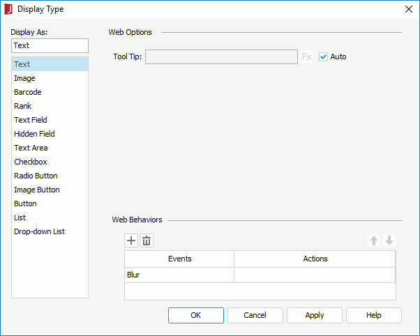
Right-click the object and select Display Type from the shortcut menu to open the Display Type dialog.
In the Display As box, select Text.
In the Web Options panel, if you want to specify a tooltip for the text, uncheck the Auto option, then in the Tool Tip text box enter the tooltip you want to show for the text. If the component is in a page report that is created using query resources, you can also use a formula to control the tooltip: click and select a formula from the drop-down list. If a DBField is selected from the drop-down list, the first record of the field in the database will be used as the tooltip. The tooltip will be displayed when you hover the mouse over the text at server runtime or in HTML results.
When the Auto option is checked, the tooltip cannot be customized. Then at server runtime or in HTML result, when the text cannot be fully displayed, you can hover the mouse over the text to get its full content in the tooltip.
Click OK in the Display Type dialog to accept the settings on the object.
Displaying an object as Image
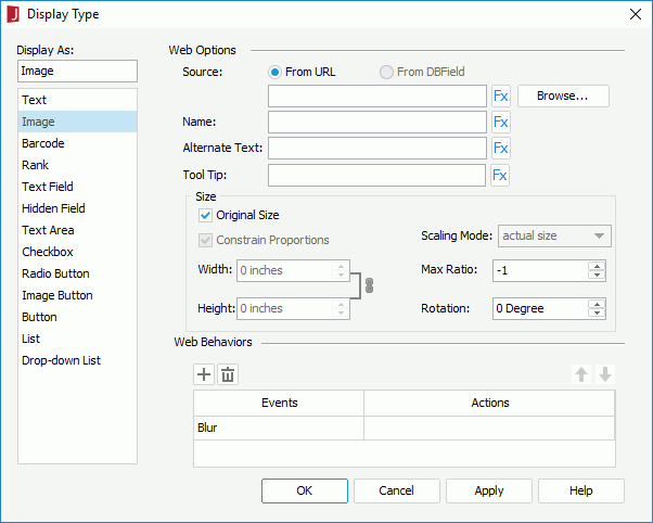
Right-click the object and select Display Type from the shortcut menu to open the Display Type dialog.
In the Display As box, select Image.
In the Web Options panel, click the Browse button to specify the image source. If you want to use a formula to control the image source, click and select it from the drop-down list. If a DBField is selected from the drop-down list, the first record of the field in the database will be used as the image source.
For a DBField, formula, or a summary, you can also check the From DBField radio button to make the value of the DBField/formula/summary the image source. If you choose this option, the Decode Type drop-down list is enabled, from which you can specify the type for decoding the image.
Type the name of the image in the Name text box, or click and use a formula or DBField to control the name.
Type a string in the Alternate Text text box to serve as content when the image cannot be displayed, or click and use a formula or DBField to control the alternate text.
In the Tool Tip text box, enter the tooltip you want to show for the image, or click and use a formula or DBField to control the tooltip. The tooltip will be displayed when you hover the mouse over the image at server runtime or in HTML results.
In the Max Ratio text box, specify the maximum scaling ratio of the image. By default the scaling ratio of the image is not limited. If it is set to any value greater than 0, the actual scaling ratio is less than or equal to it.
Specify the rotation degree of the image in the Rotation text box.
0 - No rotation.
Positive value - Rotates the image clockwise.
Negative value - Rotates the image anticlockwise.
If you want to use customized image size, uncheck Original Size, then set the display width and height of the image in the Width and Height text boxes, check Constrain Proportion to constrain aspect ratio of the image when setting the width and height. Then specify the scaling mode of the image from the Scaling Mode drop-down list.
The following are the available scaling modes:
actual size - If selected, the image will be shown in its actual size.
fit image - If selected, the image will be scaled to be wholly shown.
fit width - If selected, the image will be scaled to fit the width of the image viewer.
fit height - If selected, the image will be scaled to fit the height of the image viewer.
customize - If selected, the image will be scaled according to the width and height that you specify in the Width and Height text boxes.
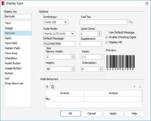
Right-click the object and select Display Type from the shortcut menu to open the Display Type dialog.
In the Display As box, select Barcode.
In the Web Options panel, select the required barcode type from the Symbology drop-down list. You can preview the format of the selected symbology in the Preview box (for details about the different symbologies of barcodes, see Appendix 3: Barcode Symbologies).
In the Tool Tip text box, enter the tooltip you want to show for the barcode. If you want to use a formula to control the tooltip, click and select a formula from the drop-down list. If a DBField is selected from the drop-down list, the first record of the field in the database will be used as the tooltip. The tooltip will be displayed when you hover the mouse over the barcode at server runtime or in HTML results.
When the Auto option is checked, the tooltip cannot be customized. Then at server runtime or in HTML results, when the text cannot be fully displayed, you can hover the mouse over the text to get its full content in the tooltip.
From the Scale Mode drop-down list, select the unit for the values of Quiet Zone, Narrow Width, Supplement, Height and Ratio.
Specify the space around the barcode in the Quite Zone text box (most symbologies require quiet zones that precede and follow the barcode).
Change the default value of the barcode in the Default Message text box if necessary. If you check Use Default Message, the message will be used as the barcode value when you view the report result. Otherwise, the message will only be used in design mode.
Specify the supplement of the barcode if necessary.
If you select the barcode type as Code 39, Code 128/128A/128B/128C or Codabar, you will not need to set the supplement.
Set the barcode bar width in the Narrow Width text box, and the height of the bars in the Height text box.
Specify the width ratio of the thick bar to the thin bar in the Ratio text box if you selected the barcode type as Code 39 or Codabar. The ratio can only be 2.0 or 3.0. Any ratio values not equal to 2.0 or 3.0 will be regarded as 2.0.
Specify the rotation angle in degrees in the Orientation text box if necessary.
Select the Enable Checking Digits checkbox if you want to include check digits in the barcode.
If you selected the barcode type as Code 39, Code 128/128A/128B/128C, or Codabar, then you can check Display HR to display the barcode numbers together with the barcode.
Barcodes can also be used as independent component and inserted into a report directly. For details, see the section Barcodes.
Displaying an object as Rank
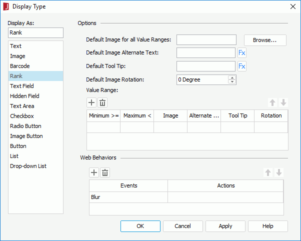
Right-click the object and select Display Type from the shortcut menu to open the Display Type dialog.
In the Display As box, select Rank.
In the Web Options panel, click the Browse button to select an image file to be the default image (used if a value does not fit any of the specified value ranges).
Type a string in the Default Image Alternate Text text box. The string will be displayed when the default image cannot be loaded or is unavailable. If you want to use a formula to control the alternate text, click and select a formula from the drop-down list. If a DBField is selected from the drop-down list, the first record of the field in the database will be used as the alternate text.
In the Default Tool Tip text box, enter the tooltip you want to show for the default image, or click and use a formula or DBField to control the tooltip. The tooltip will be displayed when you hover the mouse over the image at server runtime or in HTML results.
Specify the rotation degree of the default image in the Default Image Rotation text box.
0 - No rotation.
Positive value - Rotate the image clockwise.
Negative value - Rotate the image anticlockwise.
Note that when you rotate an image, the rectangle that holds the image maintains its original size, which may result in that the image exceeds the field border and therefore the parts that extends outside of the border will be cut off.
In the Value Range box, specify different ranges according to your requirements. For each value range, you should specify the minimum value, maximum value, image, alternate text, tooltip and rotation. A value, which is larger than or equal to the minimum value of a range and less than the maximum value, will be displayed as the image, or the alternate text if the image cannot be loaded or is unavailable. For a value belonging to two or more overlapping ranges, the highest range in the Value Range box will apply.
Click or to add or delete a range, and or to adjust the order of the ranges.
Ranks can also be used as independent component and inserted into a report directly. For details, refer to the section Ranks.
Notes:
If you have specified a tooltip, the tooltip will be displayed differently on different browsers:
On Internet Explorer, the tip text is automatically wrapped if its length exceeds the maximal tip width the browser allows. In addition, for Internet Explorer, you can manually make some text displayed in a new line by adding 
 or 
 ahead of the text when editing the tooltip.
On Firefox, the tip text is displayed in one line with the maximal tip width the browser allows, and the text that cannot be displayed within the width will be cut off and replaced by ellipsis.
When you rotate an image, the rectangle that holds the image maintains its original size, which may result in that the image exceeds the field border and therefore the parts that extends outside of the border will be cut off.
 Previous Page Next Page
 and select a formula from the drop-down list. If a DBField is selected from the drop-down list, the first record of the field in the database will be used as the tooltip. The tooltip will be displayed when you hover the mouse over the text at server runtime or in HTML results.
 or
or  to add or delete a range, and
  or
or  to adjust the order of the ranges.